 Eight
times out of ten, after entering the MET, I take a left towards the Greek
statues. I’m not sure whether I do this intentionally or not, but this visit
was no different. The change of logo and décor was puzzling. It was my first
time visiting since the change. I don’t see myself ever getting used to it. I’m
still hoping for some sort of delayed outrage that will cause the museum to
revert to its previous, much more appealing logo. I found myself paying
attention to the lighting and positioning of the many sculptures. I noticed the
focus of light each statue received, as well as the contrast the marble had
with the wall color and the floor. I wondered if the sculptures themselves
would have as much impact in an environment not designed to show them off.
Would this look as good in my poorly lit room? Pictured is a particular doorway
that caught my attention. There’s many like it, but there was a hidden symmetry
that brought my attention to this specific one. The way the sculpture shined in
the background made me question if it was intentional or if I had just found a
secret, flattering angle. I was going to continue to the modern art section,
but I saw there was a new exhibition I had not seen. “Vigée Le Brun: Woman
Artist in Revolutionary France,” I had never heard of her, but the period
seemed of interest.
 I was trying to remember what exactly was in the spot before this exhibition, but I couldn’t remember. It’s almost as if the MET is capable of spontaneously producing space. The walls of this particular exhibit were light grey, almost silver. Ever since last class I’ve always been looking at the wall color before anything else. The gold borders (which were present in every painting) contrasted very nicely, surprisingly. I’m not too familiar with art periods, but Le Brun’s paintings reminded me of the all the European paintings you see if you go straight forward after entering the MET. They just looked a little more surreal than usual. Her detail with eyes was particularly striking. The gazes of the portraits brought me down to earth. Realistic, eye appealing, draining, it’s almost as if I was right there with them.
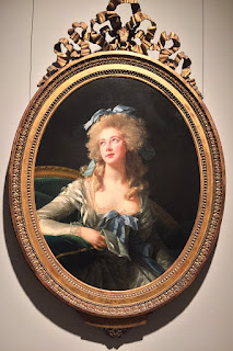
 The painting titled
“Madame Grand” was the first to really capture my attention. I had seen this
painting before. I even have it saved on my hard drive in my little ‘art’
folder. I hadn’t bothered to check the artist. The caption on the wall declared
the painting a “modern Saint Cecilia.” The most pleasing part of this painting
is the way the light hits the ribbons decorating Madame Grand’s dress. The
representation of textures is accurate; you can almost touch them with your
eyes. The dress itself is composed of many textiles. The shining skin pigment
is enticing. It’s an angelic painting. At the same time, the stubbornness
present in the eyes forms an interesting dichotomy with what the painting as a
whole is attempting to represent. Here, Le Brun attempts to frame the entirety
of Madame Grand. Her “musical, clever and attractive” side, but also revealing
a woman capable of “extra marital affairs.”
 |
| Self-Portrait, 1790 Oil on canvas Vigée Le Brun |

good work Jonatahn- I think that special exhibition was Kongo sculptures last, it changes. Good close looking at theLe Brun works. Also,refer to "borders" as frames.
ReplyDelete