How many elements do you think you will be able to find in a painting? In the painting The Great Wave of Kanagawa, I was able to find five different elements Hokusai used to create this painting. The Great Wave of Kanagawa was one of the most well known Japanese artwork. It was created on 1829 to 1832. Although it is almost 200 years old, the painting has a very modern feelings to it. However, it also contains the style from ancient Japanese art, the clean and curve lines.
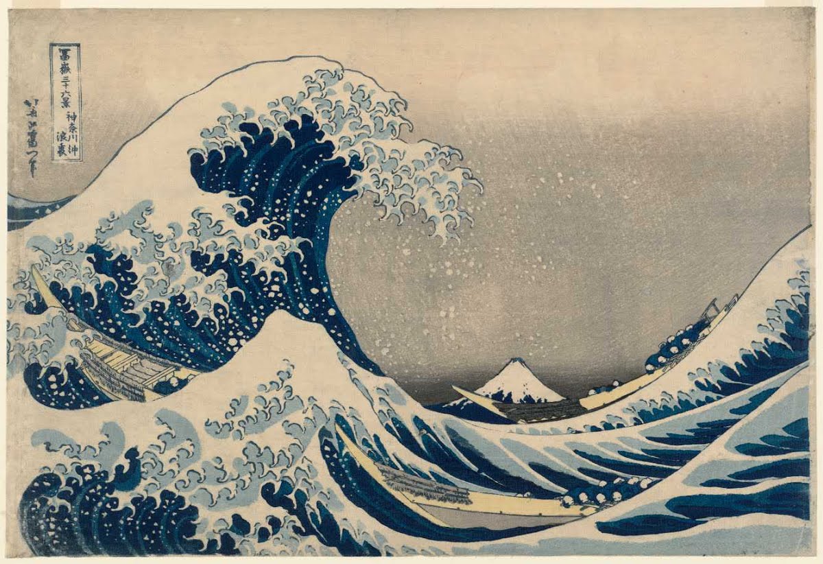
The first element I was able to find once I look at the painting was line. In this painting, Hokusai used line to create the shape of the wave, also the motion of the wave. This leads to the second element I found, contour line. Hokusai used long curve line to contour the shape of the wave and he used small curve line to show the contour of the motion on the edge of the wave. With both subjects being in curve lines, I think Hokusai was able to balance out the painting. In this painting you can see a wave in the middle of the frame. In front of it, you can find a shorter wave in the front. Between these two waves, there are three sail boats. Then when you look further into the painting, you will be able to visual a Japanese volcano in the back. This is known as the background, mid-ground, and foreground, it is the third element I discovered. Most artist would chose a different color for their background, but Hokusai used the same blue and white as the waves on the volcano. However, he was still able to show the distant of the volcano from the waves by using scale, that is the next element I thought of. The waves is much bigger than the volcano in the background, so every when Hokusai made them same color, you can still able to tell them apart. Last but not least, unlike hatching and shading, Hokusai chose to use different value range as the color on the wave. I thought that was a smart idea. Wave is a very strong force, Volcano is a very powerful terrain, and at that time Japanese man were force to be strong and powerful. By using the value range, Hokusai made the painting look much more strong and powerful. If he used shading or hatching, it would look more dreamy.
Showing posts with label BP#2. Show all posts
Monday, April 4, 2016
Zoma: drawing technics
In Wednesday March 30 lecture, we
learned about elements of drawing used by artists to convey their message
throughout their work. Some of those Technics help to produce an illusion of
space, on plane artworks. A viewer of a two-dimensional art drawing has full
knowledge that he is watching a plane work. However he cannot free himself from
the illusion of space throughout his exploration of the picture. We will
discuss the elements of drawing used by artist by describing the drawing Village
Street. Granada [?] drawn by Santiago RusiƱol (1861-1931) on paper, with
graphite pencil.
A line is a mark that connects two
points. The line can be understood as the basic form from which derived all the
forms, even curves, in the sense that a circle can be considered as a
connection of very short lines. In the picture, we can only see a few lines especially
used to represent sharp objects as short fissures and folds on the floor. We think that the artiste has drawn his work with a bold pencil.
A contour line is a line that
outlines the shape of an object. Contour lines are succession of lines. They can take any geometrical
form according to the shape of the object. In this picture, it is not easy to
see contour lines because the artist has ingeniously shades his work, so that
the contours of objects appear to be the boundary between shades of different
tones. However, we were able to see some contour lines by a zoom of the picture
and they are cracks in the mount wall on the back right.
Foreground/
Middleground/ Background are the three areas in an artwork which determine
proximity and space. Foreground objects have a intense tone and contour line, and
are very rich in details. Background objects are vanishing and lack in details.
Middlegrounds are in-between. As an example, we can compare the person standing
at the back, whom we can barely distinguish his or her head, to the front of the
building that presents significant details.
Overlapping
is the placement in a composition of one object in front of another, in order to
create the illusion of depth. The artist trying to represent a three
dimensional scene on a plane, has to create the illusion of the respective
positions occupied by objects in his composition. Overlapping is emphasized by
the contrast in tones between objects,
the shade and shadow between them. In the picture, we can see that the building
is behind its doors.
Relative
size/Scale relates the size of one object of an artwork in relation to
another. In this Technic, the same object at different distances would look
different in size, bigger when near, and smaller when far. In this artwork, the
stairs that is uniform in size, becomes smaller when getting far.
That illusion actually makes us believe that it is uniform in size.
Value
defines the tonal ranges in an artwork, from light to dark. The color of
objects, the texture of their surface and also their exposition to light will
determine their values. If consider again the example of the stairs, we see
that value is used to exhibit the grades of the stairs.
Hatching/Cross
Hatching is the use of lines to show value. In this picture, the artist did not
use a lot of this Technic to express the value of objects. However, in the
front right while looking at the picture, we can see a little area in bold hatching. The
dress of the person standing, looks to us like in hatching tone.
Shading
is a smooth blending to show range of value. Most of the values in this artwork
are expressed through shading. It looks like the artist did not use contour
lines at all.
Linear
Perspective is the use of converging lines that meet at a vanishing point. All
shapes get smaller in all directions with increasing distance from the eye. In
the building, we can see the effect of perspective. The horizontal lines at the bottom of the building are ascendant while those at the top are descendant. We can illustrate that by making horizontal lines on the pictures. We found out that the Horizon is almost at the top of the door, because the top line of the door is horizontal on the picture.
The Annunciation
The
picture I chose is Andy Warhol's version of Leonardo Da Vinci's painting called
The Annunciation. I was a bit confused as to what was happening in the photo so
I looked up the original and I could see the comparison. (Both pictures are
below). In Andy Warhol's picture you can see the contour lines within the
painting. They are even black lines and the same evenness when it comes to the
details on certain things. The contour lines and colors of the picture are even
giving a 3-D effect even though the painting is 2-D.
The foreground of the painting would
be the space with the hands out stretched to each other on each opposite side
of the picture. The middle ground would be the trees, the stone wall, and the
platform connected to that wall. The background would consist of the mountains
and the smaller, barely noticeable, trees. The overlapping of these 'grounds'
created the concept that were there seeing what's in front of us but also far
away by making the background small as if we are really further away. This is
where relative size also comes in because that would be the actually size of
the trees and mountains if we were standing within the perspective of where the
painting took place. The light source of the painting is coming from the
background of the picture due to the way the objects are being shadowed. Due to
the way the painting was remade the colors used in this painting is more one
toned than the colors actually being shown darker or lighter. The value isn't
really changing.
The vanishing point of this painting
would be that huge mountain in the background layer. You can notice how its
within the middle of the painting and everything points back to it. Using the
liner perspective, the building on the side, including the platform extending
from this building, is pointing back towards the mountain also. Now that I
actually know the terminology for describing art, this intrigues me because I
haven't used some of these techniques. I think I'm actually going to start
trying to. :)
Andy Warhol's depiction of The Annunciation
Leonardo Da Vinci's original The Annunciation
Creating Space
The painting titled “East Hampton
Meadows” by George Henry Smillie exemplifies many of the attributes that are
used to create shape on a flat 2D surface.
The foreground consists of a tiny pond that seemingly stretches beyond
the field of vision of the viewer. The
middleground consists of a makeshift wooden fence that may or may not be used
to demonstrate a barrier or fence between two plots of land. The middleground
also contains two trees on both sides of that fence. The background contains a clear sky and trees
that veer into the horizon after a sizeable distance between the makeshift
fence. Upon closer inspection,
significant details begin to emerge from the painting. For example, the artist uses different
shading and blending techniques to demonstrate which parts of the pond in the
foreground are shallow and also which parts contain more depth, which are
highlighted through the usage of light and dark respectively. It perhaps can even be speculated that the sun
may be past its zenith due the shadows of the trees in the middleground
pointing towards the east. The artist
further applies the use of value to demonstrate the time of day by making the
right side of the painting lighter than that of the left, perhaps also
indicative of the location of the sun.
This artist also utilizes overlapping by adding ducks and geese of
different sizes in the foreground and placing them against one another to
portray a sense of depth. Also it is to be noted that the animals are painted
in accordance to their relative scale in which they do not appear larger than
that of the pond besides them, which further emphasizes their size and
relationship within the foreground. Upon
deeper examination, the artist utilizes hatching and cross hatching to add
depth and value for the thickets that rest around the pond in the foreground
and also around the landscape surrounding the pond. The details within the leaves of the trees in
the middleground also are given shape and form through the use of hatching and
crosshatching. An interesting detail appears when focusing on the horizon line,
the artist adds a glimpse of different color on the left-hand side behind the
canopy of trees that make up the background as if to imply that there is indeed
more land that stretches even further behind.
This beautiful painting cumulates into a very satisfying experience for
the viewer because there is an abundance of detail in both a general and
close-up analysis of said painting.
Isle of the Dead
I have chosen an allegorical painting titled “The Isle of the Dead” by Arnold Bocklin, oil on canvas, dated
back in 1880, found at “WIKI ART” website.
Many video games were inspired by poems and paintings, in addition to other arts. Maybe the nintendo’s
famous game ZELDA was inspired by this painting, whose mysterious and ominous-looking island was
very similar to Bocklin’s dark islet.
From a picture plane’s point of view, the painting’s theme appears very close to us. The horizon line
is located almost at the bottom of the canvas. The line clearly separates the water (the foreground) from
the island (the middle ground). The spectators are under impression as if the water represents the
reality: our world. The isle represents as if the world beyond, the world that awaits us for exploration and
questions that need answers. From a linear perspective the artist even included the vanishing points,
two small lines of both sides of the isle, the points where the navy-blue sky(the background) meets the
water. On the right side, between the h.line and vanishing points, there is small area of water
overlapping, creating the illusion of the depth of the isle, and distance in the water.
On the meeting point of the isle and water, the painter placed a boat with people. One of them is dressed
in white, hooded robes, appearing as a saint, standing on front of the boat, while the other person, with a
long golden hair and brown robes, sits and conducts the boat with oars. It is very hard not to be under
impression as if we were those people who have just arrived to isle. But from the imagined spectator’s
point of view I was under illusion as if I was following the boat from a great distance as a spy, or a
witness.
Picture plane in this scenario gives us the sense as if we could touch the island: its trees blackened by
the night’s hours and its monastery-like construction built within the giant rocks. The first reason is its
scale, where the objects above the line are enormous; while the object below the line, in this case a lake-
like water, is very small, relatively ignored. The second reason is the value, where the water is very dark,
actually black, while the island has very bright details, like golden-yellowish rocks, and a white building
peeking in between the left rocks (overlapping each other). The dark(black) trees in the middle of the
isle, with very fine contour lines, reach high into the sky almost touching the top of the canvas,
emphasizing the whole score of the scale of the isle. The painter used crosshatching for the blackened
trees where they bland nicely with very dark navy-blue sky. From left to right he used a shading and
hatching techniques for the sky, contrasting from lighter to darker tones.
It’s claimed that the painting is exhibited in a gallery in Switzerland, as well as in the MET museum, since
there are more versions of this painting. “My” version has people on the boat, but one of the alternatives
has only a saint-like woman standing on the island (there is no boat).
Drawing Analysis - Blog Post #2
Throughout class last week, we discussed the multiple elements involved in drawings and learned how all of them play an important role in the final product. This was certainly helpful for me as I always had trouble breaking works of art down upon seeing them; I used to just kind of assume these talented artists just went from point A to point B and then that was it, they ended up with these great pieces. Now, however, I understand that there are all kinds of different steps taken in the creation of the drawings, and it makes it easier for me to spot ways in which the art was made.
This is the case in Study for a Design of a Stadium to Watch the Stars, a graphite drawing made by Ettore Sottsass which is part of his "The Planet as Festival" series. The series illustrates the idea of a society in which people do not work and are not constrained by cultural pressures.
In this drawing, we can see the foreground, being the overlapping stadium in the front; the middleground as the terrain behind the stadium, and the background which would be the ocean all the way in the back. The horizon line is clearly established, as the sky is separated from everything happening below.
There are a lot of different kinds of lines used in this drawing. For example, there are a lot of contour lines used for the stadium. The stairs, overall structure, and even the columns in the middle are all drawn using lines similar in length, effectively outlining everything without shading very much. However, the smaller structure overlapping the stadium definitely has a lot more shading and variation in lines drawn. The same goes for the area behind the stadium; while there are still some contour lines, they are accompanied by thicker lines and some shading.
Speaking of shading, note the different values present in this piece. The stadium and ground beneath it, for instance, is relatively light; there is some shading but it's nothing too drastic, such as the hatching used on the ground. The building in the very front, however, has a very dark cone-shaped structure at the top, and has some darker areas around the circular portions of it as well. Even tiny areas of the drawing, such as the little palm tree by the stadium or the rubble surrounding it has variations in shading. And we can of course see the same thing happening in the background as well with the rocky terrain; there are some areas that are light, but other parts, like the roads sloping down from the beach, are very dark. The sky is itself a value range too, going from dark to light the further it moves down.
Blog Post #2
Strasbourg, le Pont du Corbeau
1936Maurice AchenerBorn: Mulhouse, France 1881Died: Paris, France 1963etchingplate: 7 x 12 in. (17.9 x 30.5 cm)Smithsonian American Art MuseumGift of Chicago Society of Etchers1935.13.498Not currently on view
Achener's painting is a beautiful
piece of art that captures the true reality and impression of the setting. As I
looked at the art piece i was mesmerized because the tree is exactly the way
you would go outside and see it with your own two eyes. The painting
is very realistic and the shading and lines are impeccable. In a formal analysis
the painting is used many tones of shades which is what gives it life and the
exact detail that it needs to give it life is also impressive. I wouldn’t even
be able to do that with my pencil. On the stylistic analysis the painting is
very comforting and I can guess that the location of the painting must be one
the artist enjoyed and knew very well. The artist captured details that would
have taken time to notice. Not everyone has an eye to see and appreciate the
true beauty of nature, the way the artist captured it in his painting. The artist
definitely has the skills and the artist perspective to capture the scenery so
perfectly. You can also witness the lines used and contour lines which is
definitely in the work of art. Especially the tree uses these lines and the
buildings. In the painting we definitely can see the foreground, middleground, and
background. The tree is the foreground, the building behind the tree is the
middleground and the background is the other building more visible on the
right. The relative size and scale is also very visible because the tree and
the house/ building is visibly more larger. As we move to the background its relatively
smaller. The painting also has different values and shading which is what makes
the painting look like art and not just a bunch of lines in a piece of paper. In
the detail of the tree it’s possible that the artist used hatching and
crosshatching in order to shade certain details of the tree. For the linear
perspective, vanishing point, and horizon line is hard to tell. It could be
possible that it has two of each. It could be that it has two of each.
Monica Luna-Serrano
Blog Post #2: Drawing Analysis
#2
![]() |
Interior of St. Peter's Illuminated Louis-Jean Desprez 1776-1784 |
Painting Analysis
In the last class, we learned about how an
artist uses painting techniques to make a painting become more “realistic”. The
painting that I pick is “Rua Direita no Rio de Janeiro” (1822 - 1825).
It is an ink drawing on the paper.
By viewing the painting, I see this painting
was divided in three parts. The first part is Foreground where have
dozens of people in front of the painting. I think this part is also where the
author wants viewer focus on because this part is darker and has more detail
than others. Second part is Middleground which is people in the middle
of the street and buildings on the side of the street. This part is lighter
than the Foreground, and less detail on the objects. The last part is Background
where at the end of the street. In this part, I see an indistinct hill with
a building on the top.
Painting techniques are observed in this
painting, Author overlaps people or objects together to create the
illusion of depth, and also shaded
people and objects in the foreground to create value. Overview the painting, I
see that value of the painting shift
from the bottom to the top, from the dark to the light.
In the middle ground, people and buildings do not have much detail, and
they are Contour Line. The author
used painting techniques of Hatch and
Cross Hatching to create shadows on
the wall and inside of windows. The buildings also notice me that the author was
standing at the left-bottom corner because Linear
Perspective of the buildings show me that the author was standing there and
look all the way down to the bridge.
Drawing Analysis
This perspective drawing is entitled “Terezin: Work Brigade”
(1943) drawn by Leo Haas, an occupant of the Terezin work camp during World War
2. It depicts a work brigade leaving the camp to begin their labor for the day.
The medium is ink wash and pen on paper. The drawing is composed of contour
lines that appear to be drawn with pen then shaded with ink wash. There is a
range of values that are lightest in the foreground figures then get progressively
darker as the figures recede into the background. The horizon line is located
toward the top of the work, indicating that the workers may be travelling down
a hill. The proximity of the foreground figures is intimate and familiar.
Despite the conditions, the workers all appear relatively happy and ready to
start the day. This may indicate optimism, perseverance or hope for the future.
The people are overlapped down the line and the figures become smaller and
darker so they appear to be further away in the mid and background. I would say
this drawing is one-point perspective with the vanishing point located towards
the upper right off of the page where the figures appear to be marching from. The
shading is smooth with no hatching. The composition and detail of the people is
particularly eye catching, with the eye going from front to back in the
procession. The background with the scantily detailed camp and gate is
intriguing and balances out the picture quite nicely. The middle ground of the
drawing is occupied with the road to the left and the clustered figures to the
right. The curvature and balance of this work brings to mind the yin yang symbol,
which is probably not related. The composition leads the viewer to intuit that
the artist is quite familiar with the subjects and identifies with them. On
further reading this is indeed the case, as Mr. Haas was a fellow detainee.
This drawing is well balanced compositionally, has remarkable detail and
character, and successfully portrays emotion and the illusion of space. Thumbs
up, Mr. Haas!
The elements of Drawing
We learned how relate to other
objects to create space in drawings on flat paper in the last class. Shading
creates real dimensional of the object and also the space around the object.
Viewer’s eyes get into believing the illusory dimensionality with pleasure of art
even though they know that it is flat.
The title of this drawing I chose
to describe the elements of drawing is “Perspective elevation, Poles Hall, near
Andover, Hampshire.” The artist is T. W. Dawson (British, 1870). Drew by using
pen and black ink.
This drawing is not only contour
line drawing. The shadows are depicted by hatching and cross-hatching to create
different values. It helps to show volume and depth of the house and depict its unique design. There are many ways of drawing cross-hatching to create
tonal range. Also, the direction of hatching is important to create distinction.
I can assume that the light hit from the left side of the object because the
darkest area is the right side of the ground where the house meets.
In addition, there are relative
size/scale technic. Compare to the front tree, the trees behind the house is
smaller and foggy. That makes the trees behind the house more back.
There is foreground/ middleground
/ background technic to determine proximity the space. Also, overlapping is
used trees and the house.
This is used the liner
perspective. The horizon line is set in lower place of the paper, and two-point
perspective technic is used. The vanishing points are somewhere in the trees.
This helps to show the illusion of the space. I feel that the center of the
house is close to viewer and stands out. And I feel like I’m standing in front
of the house and looking up it. It leads me to think that the house is not
small house. What I think from this house is that it is necessary to decide to
use which value range for each shadows to create the overall of sense of space.
Sunday, April 3, 2016
Drawing Analysis
In our last class, we talked about different techniques artists may use to create space and perspective in their drawings.
For this blog post, I picked a drawing called "Dancer With Fan" made in 1880 by a French artist named Edgard Degas (1834-1917). The areas in an artwork which determine proximity and space are foreground, middleground and background. In this drawing, the dancer foot appears to be in the foreground while her right arm and the fan are in the middleground and her left arm placed in the background.
The fan is overlapping the dancer's chest and left arm which creates perspective. Overlapping occurs in a compositition when an object is placed in front of another, here we can see that the fan is in front of her body.
Another technique observed in this artwork is the way Degas hatched the fan and the hair to make them appear darker. He also shaded different body parts, the floor and the wall to create value. The shift from light to dark creates value. The tutu being so light suggest an idea of transparency, eventhough it is overlapping her legs, we still can perceive them through it.
The position of the dancer's feet create an idea of distance. Her right leg being seemingly longer than the left one and overlapping it suggest that it is forward. Her left foot and left elbow are at two vanishing point.
The dancer's body has dark and strong countour lines and the variations in the tonal range creates light and volume.
Artists use the side of their pencils to create shade, in this drawing the shade behind the dancer's upperbody creates the idea of a wall in the background.
Degas used many of the techniques we talked about to give life and depth to his dancer. It was mostly a work of value.
Subscribe to:
Posts (Atom)