Tuesday, June 14, 2016


Final Project Part II
Statement

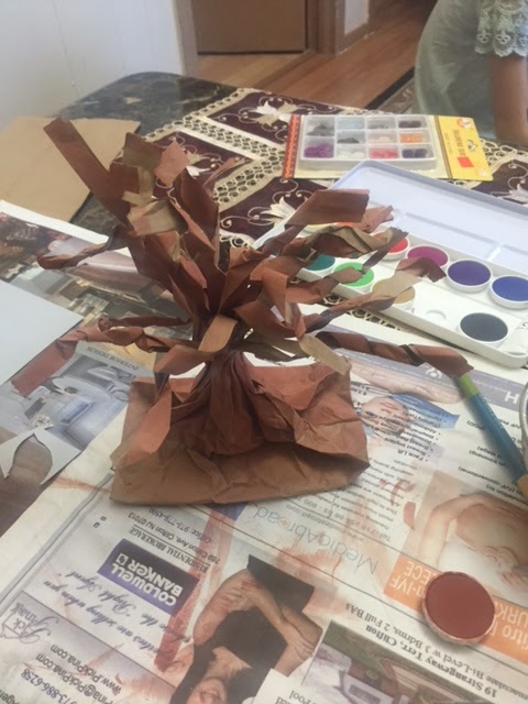
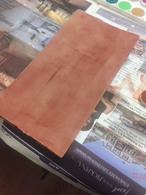
Title: Before & After HUA 101

Materials: Watercolors & Graphite pencils

My name is Monica Luna and I have attended and almost completed my first art course at LaGuardia this year. My reason for taking this course was to learn how to look at art and how to know what elements are used and the hard work it takes to create art. By taking this course I would be able to understand my child’s artistic needs and help her along the way when she would need a critique or some suggestion in her own works. Even though my major is criminal justice I figured it would be nice to understand and learn what is art. I have always loved art but never really had the knowledge in order to be able to appreciate the art works the way that we are supposed to see it.  
In creating my final project I took into account what I like to draw and incorporate the new elements of art that I have learn along the semester along with my work. I took into consideration some of the visual elements that I was able to work with. I was able to incorporate the use of my negative space and positive space, the value of lights and darks, my background has the primary colors along with secondary & tertiary colors & tried using complementary colors. I tried the overlapping but I feel I wasn’t so successful with that one. But I did use the cross hatching/ hatching shading in the project which I feel good about.
When I look at art today I try to fill my visual field with the piece of work. I look at the formal elements and the details in order to understand what is happening. As a stylistic analysis we view the characteristics of the art work and what is what makes it art, distinctive, and special from the others. Sometimes we even take into consideration the artist by doing a biographical analysis and see how the artist’s experiences and opinions shape an artist works.

Everyone can create art because we all have opinions, ideas, and imagination. We all have something to say and show the world. Either by drawing, painting, creating sculptures, even technology helps us bring our ideas to life. And all this I learned in HUA 101 and thanks to my fabulous professor Dahlia Elsayed.  


BEFORE & AFTER 
HUA 101

Final Project


Before.

                For my final project I initially brainstormed what kind of form of art I wanted to create. After the class’s last trip to the art galleries in Chelsea I was really inspired Yungsun Lee’s pieces in his show “NU” and was really set out to create a 2D drawing with a slight elements of a collage that incorporated a background with some graphic inorganic shapes. Using both sheets of paper provided to me by Professor Elsayed, I planned to draw and create my shapes on one and then use the other to cut, draw, color and cut out the word “Final” from. I wanted the word “final” to be a focal aspect to my piece because my finals at school were the only thing I could really think about, so I drew inspiration from this aspect of my life as well. Drawing the background of the piece I used a ruler to create what I wanted to be really sharp sporadic lines that I wanted to reflect a sense of anxiety or uneasiness, feelings often associated with finals week. I chose to use the colors red and yellow in attempts to create a bold statement. I also wanted to leave an elements of the original paper still visible giving off this idea that is still a work in progress, similar to finals week and my grades for the semester.


After.

                After viewing the rest of the final projects by the class I was really blown away by how creative everyone was and their use of the two sheets of paper. I immediately thought my project was extremely underwhelming in comparison and set out to add more color and dimension to my own work. I initially did not want to use watercolors because I thought it wouldn’t be opaque enough to give off a “bold” statement but seeing the level of opaqueness other student were able to achieve in their pieces I thought I’d give it a shot. I thought the watercolors were able to achieve a rich amount of color but it was difficult for me to maintain straight lines with the paintbrush so I quickly abandoned that idea and used a marker. The marker was able to help me add color to the piece with respect to the straight lines but left these unintentional lines from where I colored in the negative space. It wasn’t ideally the final result I wanted to achieve but I was still happy with the outcome.

Art blog post #6 Chelsea Galleries


 Chelsea Galleries


Visiting the multiple art galleries in Chelsea has given me a chance to view art in a slightly different setting from the Museums and public spaces I have observed art over the semester. I attended these galleries early afternoon on a Tuesday and a big difference from the museums which I viewed artwork this semester was how vacant the spaces were. I thought this gave me a lot of freedom to travel between art pieces without needing to consider or have regard for other viewers. I am not sure if this is the typical setting for Art galleries or if I just so happened to be lucky. Of the multiple galleries I visited that day the shows that really captivated me were “NU” at the Doosan gallery by artist Yunsung Lee and “World Eater” by Stan Narten at Kravets Wehby Gallery. Both shows featured a really amazing uses of colors and shapes in their artwork.


Stan Narten’s “World Eater” show encompassed about 5 painting that struck me as having this very intergalactic, out of space theme. Each painting almost seemed to depict a landscape different from what someone would imagine earth to look like which I think is why I automatically assumed these scenes were taking place somewhere other than Earth.  The title “World Eater” also encouraged the idea of an intergalactic setting. One detail I thought was striking was the artists use of these small white dots which were present in all the paintings. It is almost as if the dots were painted specifically to be in the foreground and the actual content of the painting just seemed to be out of focus due to the placement of these dots. Looking at the paintings it was often quite hard to actually interpret what is specifically being depicted, there were many times where I was unsure if I was looking at a person, object or some element of the landscape. But I think that unsureness is what I liked about the paintings, I was free to imagine if the white dots were eyes on a creature or specks of debris falling after an intense explosion.

 
Yungsun Lee’s Show “NU” at the Doosan gallery featured anime styled paintings of females. Majority of the paintings depicted females without limbs, it was almost as if their bodies were exploding at their knees and elbows which I thought was interesting. I think the artist intentionally did this to put emphasis on the rest of their body, which I believed he wanted to be focal.  What I really enjoyed about these pieces was not the foreground but the backgrounds. The paintings all featured these really bright, graphic backgrounds that incorporated all these cool inorganic shapes. The colors utilized in these backgrounds weren’t specifically complimenting each other but still creating really strong contrasts which gave them a lot of vibrancy which I enjoyed.

I thought experiencing artwork at the Chelsea galleries was a very new interaction with art for me. Prior to this assignment I think I had very little to no experience with art galleries so getting the opportunity to visit Chelsea, also a place I had very little experience with, and visit these galleries was something I enjoyed and plan on doing again.

Final Project


Duality


     In Duality I represented the dualities that we can face in life and the choices we have to make as we grow. I represented the duality between our roots compared to the lives we actually live.The duality between our need for nature and wildlife compared to our choice to live a city life. There is also the duality between simplicity and money, the duality between a colorful culture compared to the monochromic city life and finally, the duality between warm and cold colors. The pyramid is a symbol of elevation and it shows that I do not have to chose between all these dualities, I can juxtapose them and it becomes a whole. In order to grow and elevate ourselves we need to embrace ALL that we are, and it is important to own and tell our stories.

Duality is a 3D additive mixed media. One of the sheet is the base for the creation, while the other one has been folded to create a pyramidal sculpture. It is a mix of prints collage, duct tape, and paint. It is abstract and representational. One of the sheet is covered with a piece of fabric. There is a triangle pattern all over the work. There are organic shapes, but the sculpture and the pattern are geometrical.
In this work, I tried to include as many of the elements of an art work that we talked about throughout the semester. I tried to create something different and unconventional.I did not think about what I was going to create, I just collected things randomly that inspired me and created a story through what I collected. 

Monday, June 13, 2016

Final !!!!

The title of the drawing on the right is 'The 666 Selfie'. I used pencils, the paper, and a napkin for shading. I always start out by sketching my artwork, then I began to gave it value once I was done with the contour lines. I wasn't sure about leaving the negative space around the girl but I left it anyway. The girl in the drawing is me. I decided to do this self-portrait on my birthday, 06/06/16. Many women are concerned about their look or how society perceives rape as the woman's fault for 'dressing like that'. Women should be able to accept the way they look: skinny, thick, tall, short, black, white, Hispanic, whatever. I'm accepting the way I am, and this drawing is depicting that.


The title of the drawing on the left is called 'Grunge in 2016'. I used pencils to draw and then I used a black ink paint brush pen. After doing the outline, I then traced over the pencil marks with the black ink and then erased them when I was done so it can come out as a perfect contour drawing. No shading or value, just straight even black lines. The only value added is the streaks in her hair because of the different strokes I did with the ink brush. My first piece had lots of negative space so I felt the need to not have negative space in this one; therefore I added Nirvana in all capital letters and space like grunge doodles. Grunge is an alternative rock musical style and Nirvana is an example of grunge in music. I consider my self grunge for the simple fact 3/4 of my closet and shoes are black, I'm into piercings and tattoos, and I love Nirvana and other grunge music artist.

final blog

For the final blog I would love to say thanks to professor dahlia for being such an awesome mentor. I know that like normal students I did not start this class from the start but I am so happy that in the end I took this class. I know that I missed some essential parts of the class in the start but as I joined in I have learnt a lot. Thanks to the prof encouraging and supporting me I think I would not have been able to make it through this class otherwise. After this class I know a lot of new things, I never knew nothing about artists, painting etc. but after this class the way I look at an artwork has changed, the class has changed my vision and my thinking of things. I had never gone to a museum before and after this class I have seen so much of some famous museums of New York I really am very appreciative and thankful of the professor who had organized all those field trips for us.
For my final project I made a tree out of paper bags. I used paper bags, cardboard paper given in class, buttons, and water paints. The tree is a 3D sculpture as its free standing. the style I used is representational as it has resemblance to nature...!  the tree itself is positive space yet the empty space between the branches is negative space. the colors I used in the project are both warm, cool and vibrant...!! I have red and orange leaves which will attribute to fall my favorite season and then the surface is green which is grass which always stays green! the buttons do not have a specific pattern; the texture of the project is quite rough kind of!! The tree is actually an inspiration and an attribute of my favorite weather of the year, autumn or fall. I love the fact the way trees lose leaves and the leaves dry up in the streets and gardens. It just gives a homely feeling.
here is my tree i basically took the paper bag, painted it brown and then when it got dry i cut in with same length and twisted to make branches. 

this is when i painted the paper bag and let it dry so that it looks more realistic and natural. 

this was the final look. instead of leaves i chose buttons because i wanted to be more creative and that is what i ahve kearnt from the professor to think outside of the box. 
i enjoyed this class a lot it was my favorite class of the semester. 

final blog


        I would like to start my last blog entry by saying how much I enjoy this art class through out the course of the semester;  It was the only subject where instead of stressing over school work and final exams, I was able to relax and discover my own talents  doing my  final work of art.  At first I was undecided, I didn’t have any idea what to create, but after going to see so many museums and galleries, my imagination open. For my final project I decided to use the two pieces of paper to create two different work of art. My first work of art  consisted of a representational   painting of an elephant that is completely two dimensional, but also had a touch of a 3D painting. I was able to work with perspective and achieved that 3D effect by first drawing the elephant on a flat surface and then cutting the upper part of the paper to make it look like the elephant is coming out off the paper. Then I created some shadow to make it look more dimensional.  The material that I use was only  the paper and pencil. Some of the visual elements found  on my work of art include  the use of lines , there is hatching and cross hatching, in this case there are a lot of diagonal lines that suggest action, It seems like the elephant is waking. Shape is another visual element, the shape is a two dimensional organic painting. Value  also plays on important part in this painting, value in this case is created with shading, with a mixture of  dark and light tones. The texture is implied rough texture created by lines.  Thinking about sculptures, I would say that this work of art is  subtractive since I had to remove paper.

       My next work of art was tittle “ Beauty of nature”. This was a representational, free standing sculpture of a turtle in it’s natural environment. The material that I used was mache clay, newspaper, tape, parts of a box, and water painting, also to make it look more realistic I use real grass, and some flowers. This sculpture is additive because I added many layers of paper to create form, It is also assemblage  because I gather all types of materials to create the sculpture. I would classify my work of art as environmental art , because I use environmental materials such as grass and flowers. Some of the visual elements found in this sculpture are lines seen on the shell. In shape of space, we find some negative space in  the back of the turtle’s shell , and between his head and the shell, I would also say that the shape of my sculpture represents both organic and geometric shape, organic is the turtle and the flowers, and geometric is the squares in the shell and the base; This also creates a real and implied texture.


NOTE:  I’m so sorry I wasn't able to post the finish look for both of my projects, my phone got stolen and I lost all of my information and pictures.


Final Project


  My work is a Jail. It is a representational and abstract art about my feeling of the home when I was a child and living with my grandparents. It was made by a (2+3)x7/2 (cm) trapezoid, two 2.5x2.5 (inch) squares, four 1x9.5 (cm) rectangles, sixteen 1x4 (cm) rectangles, and one 3x3x0.3 (inch) cuboid.

  I made it because before I enter college, I only had art classes when I was a kid in pre-school and elementary school. Thus, this art class is kind of making me think back to my childhood and place where I had lived. When I was a child, I could only play with my peer after I finish the assignment from my grandpa. So I am always feeling that home is a jail. Because of language problems, although I left my grandpa, come here to start my college, I still need to put myself into an invisible Jail in order to force me to keep pace with the classes in the college


Zoma's Final Art Project

Our final project is titled "Two by two". This artwork is the expression of our vision of a world where things are made by couple, in other words two by two. This art project is a non-representational artwork. The materials used were:
-two pieces of paper that were given by the professor,
-pencil, water colors and ruler
-scissors, blade and glue.
In this project, we really wanted to be very methodical in our process of producing this work. We just wanted from our idea, use the technics we learn in class and make an artwork accordingly.
"Two by two" is our expression of a world where things are in couple like male and female, rich and poor, life and death, etc. The basic idea of the work was to dispose things in couples and connect them. First, we needed to find what kind of relation exists between the elements. We concluded that the relation is a complementary relation. In this binary complementary relation, we assigned a positive value to one element and a negative value to the other element. Our artistic interpretation was to use an additive operation for the positive element and reductive operation for the negative one. A couple of elements was represented by a pair of the same geometric form (circle, square, triangle, ...) In each pair, a cut was done through the paper for the negative element, whereas an addition  by glue of the form was done on the positive element. Under the cut on the negative element a piece of paper was glued under, but we still have the impression of deepness, while for the positive element we have the impression of the addition of element. Because of the complementary relation we have mentioned between the elements, we used complementary colors in each couple of elements. The size of each element in the couple was also taken in consideration, so that one was bigger than the other.
For the relation between the elements, we used straight lines to connect them. Because of the complexity of the relation between things, we gave the impression of 3D to the relation,  by using the effect of perspective. We used also the lines like a kind of hatching with different values that give the impression of shading. The forms are also overlapped.

The style of the artwork is non-representational. The type is towards a drawing, even if we have used some technics related to sculpture like addition and deduction, or related to painting like water colors. This project was a great experience; we have a great feeling about, and it was our introduction to art creation.

Final Project


Looking Forward to Last Night

“Looking Forward to Last Night” is an abstract 2d landscape painting. During this semester I found that I really like art that shows nature but in a slightly abstract way,  with vivid colors and dreamlike imagery. 

I used overlapping to create a feeling of texture and life. I drew the Tree,  the moon and the bird on one paper and glued them to the other one that I had painted (with watercolors) to be the background.  I wanted them to seem alive,  to stand out from the background.    

The line that the tree makes in the middle divides the day from the dusk.  I really liked the Gaugin painting that we discussed in class “After the Sermon” and I wanted to create a similar feeling with a tree being in the center.  

After going to the galleries last week I realized that if I am going to make art I want to make nature a part of it.  I was most moved by the art that included natural things.  

The triangles at the bottom right represent human’s attempt to make geometrical shapes out of nature,  they also point to the bird in the tree.  

The bird is looking to the future while thinking of the past. This is the main theme I was trying to communicate.  The moment between day and night,  sometimes half the sky is still bright and the other half is getting dark already.  I wanted to make that represent how in our lives we are moving from one phase to another,  but it's not always easy to let go of the past.  There are always good things and bad things that come with change.  But nature shows us that change is always happening,  we have to change with nature,  we can't fight against it.  


The bird is small and pretty,  but very brave to be able to live in nature and change with day and night. 

#Final Project


The name of my final project is “Finals Week”. I felt frustration and anxiety for my five finals this week. First I didn’t have any idea what I would create from these two papers but then I decided to put everything on the paper that makes me feel anxious. I took many pictures from my Anatomy book. The girl on the right represents me lost in college. I created this with a sense of irony. The right paper represents me in the current situation and the left paper represents my vision of life after I graduate.  While creating and putting my ideas together I found it very calming and relaxing. Actually this is the only final that made me feel creative and happy. This college is mix media and gives sense of pop art because it is sarcastic and funny. Because I was adding pictures to these papers this method is additive. It supposes to be relief because I did not want viewer to be able to see the back of my artwork.  I remember my shocking reaction when my advisor was telling me that I have to take Intro to Art class. I told my sister that I would rather take three calculus courses that art class. I love that my opinion and reaction to art have changed during this course. I am glad that I took this class and learned to appreciate and think about art in the deeper sense. Also I am very thankful that I had an opportunity to visit all these wonderful galleries and museums. This class definitely woke up something nice in me regarding art that I wasn’t even aware of it. Thank you for creating artistic Katarina.  :) 

Final

My work is a 3D sculpture that is painted with watercolor. It is also a contemporary art work that is combined with a representational art and abstract art. One of the paper that I got is used to make a road to blur the boundaries between art and everyday life by intersecting with an environment. The other paper is used to draw an abstract art which defines people. It is standing right across the road making a wiggly line. It indicates how we live our lives. We interact with bad things and good things and sometimes we take the long way instead of going straight to our goals.
One of the side shows the positive mind. Each color represents something. First, the background color which is sky blue represents pure, genuine, and innocent. I think people were all pure when they were young. The primary color, red in the middle represents a strong existence that they are in the world. It can also represent ambition. Around the red, you can see the primary color which is blue and yellow. The color blue represents honest and truth. Every person wants to be honest and I thought being honest comes from the deep down of your heart so I chose the color blue that gives a sense of deepness. There is also secondary color which is purple as well. Purple represents the romanticism. I think people should be romanticist instead of being a rational being. Being a romanticist helps people to have a dream and be more emotional. The color green that is across the whole paper represents our health. I believe being healthy is one of the important things in our life. Overall, this side of the paper seems to be cool toned with all the cool colors like sky blue, blue, purple, and green.
The other side shows the dark side of people. I always think that every person has dark side and bright side of themselves. I think that’s because you can’t always make positive things happen around you. That’s why every people have a sense of self defense and doesn’t want their pride to be ignored. However, I believe that people were all pure and they are born with kindness. Therefore, I colored the background of this paper with the color yellow. And the orange color is used to show how the color becomes darker and darker to black. This shows how negative things happen as we live throughout our lives and how we are influenced to environment, society, and things around us. Nevertheless, we always should always try to be positive and we ought to be positive. In this way, I put the sign stop on the road where the dark side of us is standing.

In some way, I thought this art work just represents me because the emotional responses of colors that is chosen is based on both cultural and personal of myself.The title of my art work is "The road of Life."


Saturday, June 11, 2016

Final

My piece is titled “Untitled.” While studying for exams, I began drawing straight lines on one of the pieces of paper, using an edge of a notebook. I then continued to add to the piece by filling in the 72 squares with watercolor. The colors chosen to fill in the squares was decided by what I felt was appropriate. There’s no pattern. The colors consist of red, blue, yellow, and green. There’s one lime green square, which was supposed to be yellow, but another color spilled into it. It’s my favorite square. Once I was finished, I decided it was some sort of ‘emotion board’ but I was unhappy with how simplistic it appeared. I cut the squares out carefully and put them on top of the second paper. I made many patterns and figures with the squares, attempting to decide in which way the ‘emotion squares’ created some sort of harmony. I decided a spiral represented a balance of emotions. I also thought it was funny to have squares in a circular motion. I used tape to hold the squares in place, but it wasn’t something I wanted to do. I looked at my piece and decided I didn’t like it at all so I turned around the paper and began drawing lines again; this time freehanded and compact. I thought of what I could draw to represent the opposite of a balance of emotions. I used black circles to signify negative emotions. I added a sporadic use of line in this spiral to represent how reckless and disruptive negativity can be. I had more fun painting the circles with watercolor than I did the squares. Overall, I still really dislike the piece and I think the spirals ended up looking like the Time Warner Cable logo.


Thank you.

Final Post


I decided to title my painting “Home.” I made it using watercolors on canvas paper, as well as the index cards which I cut into shapes and stuck onto the piece with a gluestick. I lightly sketched some shapes with pencil before using any paint; you can actually still see some of the pencil marks if you look closely. It’s a representational piece that is meant to depict me underwater with a jellyfish, some kelp, and fish in the background. Seeing as I stuck material onto the page, this was done using an additive process.
As you can see, the colors used are cool, for the most part. I do have some yellow sunlight peeking through the surface of the water, the latter being out of sight. I tried to use some value in the water by having the bottom appear a little darker, with the water up top being a little lighter, so as to create some depth.
This piece has a lot of significance to me for multiple reasons. First off, this scene is actually based off a recurring dream I’ve always had where I find myself underneath the ocean’s waters; nothing is really happening, I’m just sort of floating there with all this wildlife surrounding me, and then the dream ends and I wake up. Which is always disappointing to me, because one of my dreams is to explore the deep sea, as I’m fascinated with it. I’ve always felt a really powerful connection to the ocean ever since I was really young, and that’s actually why I named this piece “Home”; because when I’m in the water, or reading through my marine biology books, I always have this strong sense of home, almost as if that’s where I belong. I have a friend who’s interested in astronomy and he tells me that whenever he looks up at the night sky (he lives in the country) or watches videos about the cosmos, he feels that sense of “home” as well. I realized that was exactly how I felt with the sea.
Another reason for this name is that the ocean is indeed a home to a lot of wildlife, and we’re doing

nothing but destroying it. Litter, oil, sunscreen, overfishing, poaching; all of these things are contributing to a

really big problem, that being the decay of our oceans, which are vital to not only ourselves, but to the

animals and other wildlife that live there. I'm a big environmentalist, so these kinds of issues are really

important to me. We need to protect the animals and their homes, for their sake as well as ours.

I just want to end by saying how much I loved this class. Seriously, I never expected to learn as much as I

did, and the trips and art-making were such an enlightening process... I am eternally grateful for having the

opportunity to take this class. You all are such wonderful, talented people (I was blown away by all of your

final projects), and I sincerely wish you all the best! Good luck and have a great summer everyone!

Friday, June 10, 2016

Final project

Gary Thomas Dusek
"Continuing Education" 2016
Grey paper, project board, staples, wire hanger

"Continuing Education" is a small sculpture representing a visual pun about my personal academic path. I often use linguistic forms and devices in my visual art. I returned to school after a long hiatus, so I am currently a Sophomore in college but i am 42 years old. I also just earned my high school diploma this year.  There is a cultural idea that school and learning are solely the domain of children and young adults, therefore the visual metaphor of a high chair. The elongated legs can be interpreted in the literal sense and further as an inference to the inaccessibility of education to older adults due to finances, personal and societal bias, or familial responsibilities. I am reacting to these ideas and calling attention to the fact that they are ridiculous and counter productive to society. It is my hope that older adults strive to complete or continue their education to benefit their own future as well as contribute to society as a whole.

Thanks everyone for a great class and good luck in all your future endeavors!

Thursday, June 9, 2016

Good Luck!

Hello guys,

My name is Alan. I was born in Hong Kong. I am currently pursuing my degree in Commercial Photography. I don't like to talk much... However, I enjoy seeing, talking, and creating arts. After this class, I am more aware of arts. Learning the terms and elements made me more in depth on arts.

I had one challenge. That challenge was to create an art out of two pieces of art papers. I had ideas, but my ideas are never perfect in my mind.

The title was "The Town". The materials I used were the two pieces of art papers, x-acto knife, tape, a canvas paper, and light. I wanted to keep the art papers as natural as possible. Therefore, I did not change the color nor the texture. It is a representational relief sculpture including both additive and subtractive methods. I cut the paper, as well as taping them together. One of the biggest elements in this art was shape. The whole sculpture was made out of lines and shapes.

"The Town" shows a vision of a small town located in the mountain. On the top of the sculpture, you will be able to find clouds covering most of the space. In the middle of the sculpture, there are two mountains. Between these mountains, lies two small houses. One is located on the west and the other on the east. Beneath the mountains, there are a lake almost the same size as the mountains. Inside the lake, you can find different steepness of the lake.

The sculpture only contains a mono color. Therefore, it is very hard to view the sculpture. This is the reason why I left an extra space on every shapes I cut out. It allowed me to roll up the extra space on the shapes before taping it to create depth. Also, I arched the whole sculpture, so the center of the sculpture was curved out. This way, with the light from the classroom can bring out the shadow on the sculpture to create lines and space. The shadow will always be different as long as the lights are changing. If we move the light from the east to west, it will create the same light effect as the Sun would to a normal town, mountains, and clouds. If I was to remove all the papers that I added to this sculpture, the sculpture will resume back to the art paper form.

Some people always wonder, if something is perfect, why would you still do something to it? I can relate this to art. The art paper was perfect, it wasn't wrinkled or teared. However, if I never did anything to it, I will never knew what can come out from it.

I would like to thank Professor Elsayed and all the classmates for making this a fun class for me. I was worried to take on an honor class, because I thought it would be a challenge. Now I realized that overcoming the challenge is better than not taking it.

Best,
Alan


Final project

My art work tittle is an “Angel lives in the dark side”. Everyone has darkness and kindness in their heart. Even though people who have the sweetest hearts, they still think negatively, and bad things because we are human. Moreover, people get hurt, sad and med from other people. However, they also feel happy, touched, and joyful from them. Therefore, we always have two sides of feelings which are positive and negative sides. In my imagination, angel gives positive mind, and devil gives negative mind. Therefore, I wanted to express our heart in this final project. This art type is contemporary art and heart shape is Organic. I used bright red, and little dark red which are worm color. I also used black color to show darkness of feelings. I did not want this heart’s color becomes too dark, so I painted white color at the first, and I put red and black colors. It was very difficult to make smooth texture by using two completely different colors. I used a cardboard to create heart because I wanted to make 3D art. Moreover, I used totally different materials to create upset textures between angel and devil. First, I put feather to express angel’s wings which gives uniqueness. On the other hand, I broke CD and put on the edge of this heart to express thorns of heart. It also reflects to the light, so I can emphasis the thorns. I got great ideas in the Chelsea galleries. I used any materials to express my ideas, and I enjoyed very much to create this work. Thank you for teaching this semester prof. Dahlia. This class was my favorite class in this semester. I did not have experience to visit this much museums and galleries in NY before taking this class. I learned so many things from them, and I want to continue to enjoy art life.

BLOG Post #6

                One of the gallery I went was Dosan Gallery which holds the solo exhibition of Yunsung Lee from Korea. The pictures he drew was an animate of a girl. I read the description about him and it was interesting how he took the subject matter form Western paintings and then changed into a Japanese animation form. One of the interesting thing about his drawing is that it is within a Japan influence from Korean culture. The title of this exhibition is NU. It means new humanity which is a terminology that is borrowed from Japanese animation. Not only is the character drawn like Japanese animation, but also the background. It is really colorful and it looks like something that we would see from the comic book or animate. The characters in his drawings are very ideal. The pictures have contour line and lots of secondary and primary colors are used. It is a contemporary work art that use context and subject matter from the sculptures of Japanese comics and online games which has become mainstream in Korea.
                One other gallery that I went was Greg Parker and Jay Kelly’s gallery. This gallery has many sculptures and paintings. Most of them are abstract work. Most of the Greg Parker’s work is 2D painting and most of the Kelly’s work was a sculpture.

               The work of Greg Parker is made by oil painting and it is drawn on the wood panel. The work of his arts has many layers into it which gives an appearance of visual depth and atmosphere. This shows how he is interested in the overlap of science and art. He believes that we all exist with a mixture of passionate certainty while understanding that it could unravel at any moment. Also, he says we understand things that can’t be explained by deduction. We are comfortable knowing something we can’t prove. These are reflected in his art work that he used a range of associative elements that triggers recognition and confusion, a physical object that refuses to stabilize its identity.
                This activity was very interesting to me and I'm really happy that I get to know there are lots of galleries in New York that I can go and look at. I hope I would go to galleries and museums even though the art intro class has ended.